
Philip Harris’ Domestika Course: Dip Pen and Ink Illustration
Phillip Harris’ Course
Another course I have been really enjoying recently is the Domestika course by Philip Harris: Dip Pen and Ink Illustration: Capturing The Natural World.

I had not focused on drawing or developing my drawing skills, and have mostly sketched with watercolours, or very basic pencil sketching,
When I was looking at Domestika late last year though, a few courses really jumped out and caught my eye - this was one of them.
Why I wanted to do this course
What I was attracted to in the course was:
That it was teaching me to use a new medium - one I’d been curious about had not used for actually creating work beyond adding some outlines
Philip Harris’ style of work - the detailed pen and ink illustrations he creates are gorgeous and it is a style I love looking at

Philip Harris’ incredibly detailed gorgeous illustration.
While I knew my personal style wasn’t exactly going to be his - I love combining colour too much and like lots of colours in my work. Still, I knew the skills would be useful, plus I was looking at courses that would stretch me, that I was excited by, and that I was doing ‘just for fun’.
What the course covers
The course like all Domestika courses introduces the teacher, their work and influences before it goes into an overview of the topic of the course. It then advises you on the tools you’ll need and anything else like reference photos.
Philip Harris’ exercises on getting comfortable using a dip-pen.
Then we get to the actual nitty-gritty:
How to use a dip pen
Exercises on creating highlights, volume and depth
Practicing observational drawing using pen and ink
Sketching ideas, creating basic outlines
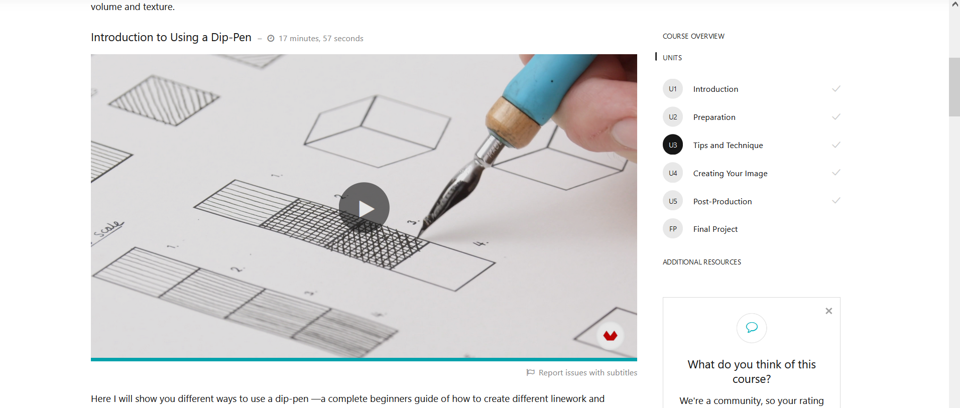
Going into your work to add cross-hatching and fine line work
The course finishes by showing you how to add a border (something I chose not to do by creating my image on the entirety of my A5 page) and how to share and sell your sketches.
What I got out of it
Well a silly thing I got out of it was actually finding out about the Tachigawa dip pen holder with a lid. This pen and the nibs by Nikko that the teacher recommends are great. The best parts about the pen though are that 1. it has a cap, and so it is easier to chuck into a pencil case and 2. it fits both mapping nibs and drawing nibs.
Sadly most of the nibs I already had (Leonardt & Co Manuscipt nibs) don’t fit in this holder, but the Nikko nibs are really great, and handle really well. I’ve been using them a lot.

Philip Harris’ exercise in observational pen and ink drawing, featuring the Tachigawa holder
In fact, the dip pen is now my favourite writing tool. I know it won’t be practical on the road - my trusty Uniball Signo 0.38 or Sailor Fude nib fountain pen will have to do for that need - but while I’m working from a dedicated desk and workspace, the dip pens are what I’ve been using for all my writing needs, and I’ve loved the process and feel of writing with them.
For art and drawing, what I’ve gotten out of the course is thinking about light and shade better, and understanding how to create that in ink, hatching and cross-hatching. I’ve loved practicing these techniques in this course. The exercises were super useful and I did some of them for each dip pen and nib I have just to see the variation and the results each could produce.
The teacher’s approach to his subject matter and composition was also really interesting. Here is a piece I did after the course/as part of the final project.

My illustration of a Spinifex pigeon against the backdrop of Kings’ Canyon (Watarrka).
I stopped a few steps short of where Philip takes his drawings but that was because once I got to this point in the piece, I knew I had to paint and add the colour in.
The colours of Kings Canyon with the spinifex pigeon are too beautiful not to include and I just couldn’t have the piece not show the wonderful colours of this bird that I’d been so excited to see in person after reading about it in the The Australian Bird Guide.
Going forward
I am definitely going to use what I’ve learnt in the course - I’m excited to create more pieces and draw more of the amazing animals and scenes from the road using this medium. The spinifex pigeon against the backdrop of Kings Canyon is honestly one of my favourite recent pieces and I’m looking forward to a few more to round out my Central Australian sketchbook.
What I love is how using the pen and ink gave definition, depth and contrast to the painting. When I first started watercolour again about 2 years ago, I did use fineliners to outline my work - since then I don’t use that style as often, but this feels different.
For one, dip pen and ink were just so much more satisfying to use. For another, I’m now thinking about how to use the medium to add depth and shading, not just outlines.

Philip Harris’ lesson on using cross-hatching and fine line work to add depth and detail
I love the combination, and as a bonus, it reduces the amount of watercolour used, making more complete illustrations possible in my mixed-media Born. sketchbook - my current favourite sketchbook for its versatility.