
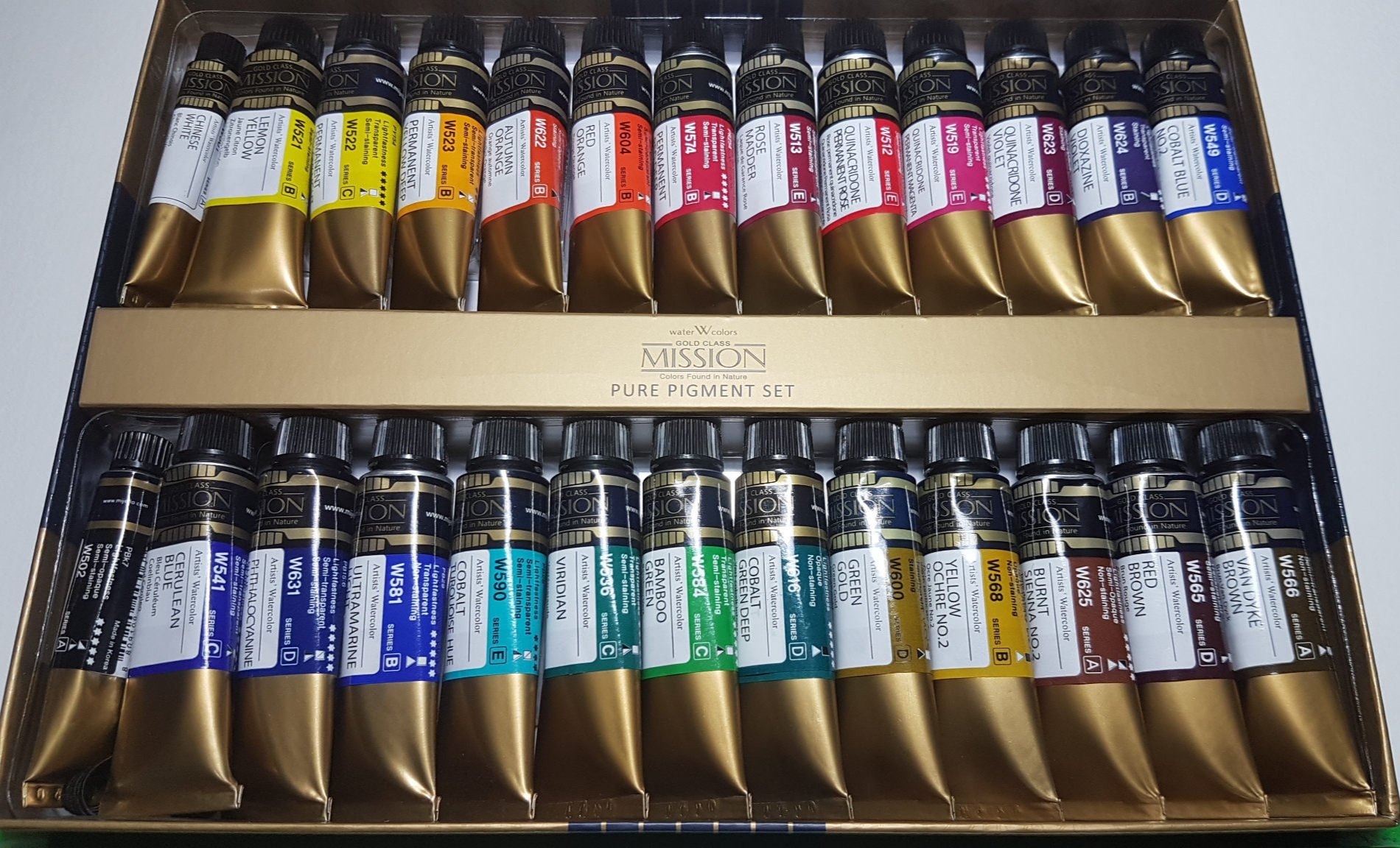
Mission Gold Pure Pigment Set
This is another post that has been percolating for a while. I bought the Mijello Mission Gold Pure Pigment Set in June 2020, so I have had over 2 years of using a lot of this set behind me and feel confident in providing my thoughts on the set. Some of these colours have made it into, and stayed in my travel palette that I use all the time as well.
The Colours
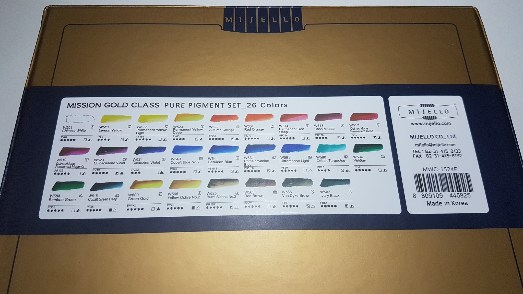
This is the version with 26 colours in the set (well really 24, 15 ml tubes and + a small 7 ml tube each of black and white). Note that the company creates a few different sets that at a quick glance can look similar. They also have a 34 colour version and a 17 colour version listed on their website.
I have heard that there are apparently different versions of the 26 colour pure pigment set depending on where you are. I have not independently seen any other sets, but just in case, if you are interested in this one, double check that these are the colours in it before purchasing.

Who is it for?
For Not-so-Beginners
The main group of watercolourists I would recommend this set to are not-so-beginners. It can also be a good set for beginners who know for sure they are definitely going to be using watercolour a lot, but there are some caveats and things I would personally do if I was in this category again which I’ll talk more about below.
So, when I started my journey in watercolour, I knew I wanted to get pre-filled pans to reduce the barriers to entry, and to make it as easy as possible for me to really give this medium a proper go. For that reason, I went to my local art supplies store and bought a few Schmincke pans based on recommendations on YouTube. So by the time I got this set, I already had a set of split primaries and a few extra colours I was comfortable and happy with.
This set was a way to supplement what I had and try some new colours I was intrigued by. I think that’s this set’s main selling point. It allows you to try so many different, interesting-but-not-essential colours at a really good price point (if you can get it at a reasonable price where you are).
For Absolute Beginners
This can also be a great set for beginners if you can find it at a reasonable price. Here in Australia, at the time of writing (September 2022) I can find this set on Amazon for $113.61. That’s 24, 15 ml single pigment professional colours for that price plus two small tubes of black and white.
The Daniel Smith split primary watercolour essentials set (a great set for beginners) costs about $55 - $80 depending on the store and whether there are sales. That’s 6, 5 ml tubes. So for about double, you are getting a lot more value.
But, that’s not always the only consideration.
If you are not sure if watercolour is for you, I would recommend picking up the Daniel Smith set (or a good student quality set like the Winsor and Newton Cotmans). Yes you are getting less but, it is cheaper and an easier start in watercolour. You are also less likely to be overwhelmed by all the colours in a larger set like the Mission Gold set. If you find watercolour is not for you, you’d have wasted less.
If you have a friend who can give you small pans of a basic split primary set of colours to try, that’s even better.
However, if you are sure you want to really get into watercolour, and will want to try many different colours, then here’s what I’d recommend:
Get the Mission Gold Pure Pigment Set
Put aside ALL the colours except for a split primary set or even just a limited primary set of 3 (see below for some suggestions)
Practice and get comfortable with those colours, mixing and really understanding the primary wheel and how mixing works with watercolour
Then, slowly add in other colours you’re intrigued about and play
Provided below are a suggested split primary set, and some primary triad options. There are of course many other combinations you can play with in this set, which is a lot of fun once you are familiar with the basics.
One Possible Split Primary Set

Here is a colour wheel of the split primary set I would start with: Permanent Yellow Light (PY 154), Permanent Yellow Deep (PY 65), Permanent Red Deep (PR 254), Permanent Quinacridone Magenta (PR 122), Ultramarine Light (PB 29), Cerulean Blue (PB 15:3) - this is usually called Pthalocyanine Blue green shade. Cerulean blue is a whole other pigment but that’s what Mission Gold have confusingly decided to call this colour. Either way, look for the pigment number PB 15:3 in the set.

Here are the same six colours by themselves.
Limited Palette Primary Sets
Quinacridone Permanent Magenta, Permanent Yellow Light and Cobalt Turquoise

PY 154, PR 122 and PB 28. This combination is probably closest to a true magenta, cyan and yellow primary. It creates really bright greens and purples and is my preferred triad.
Permanent Yellow Deep, Quinacridone Permanent Rose and “Cerulean Blue”

PY 65, PV 19 and PB 15:3. This set creates gorgeous warm oranges and deeper purples as well as some more muted olive greens which I love.
Green Gold, Quinacridone Violet and Cobalt Green Deep

PY 150, PV 19 and PB 36. This set is an interesting combination - it creates nice deep colours in oranges and purples that I would associate more with autumn however you can get some nice bright greens with it too. Green gold (PY 150) is a great, fun yellow that can lean both cool and warm depending on how much of it you use.
For Experienced Watercolourists
If you are an experienced artist with tons of colours and experience with them, odds are you will already have your own brand and colour preferences. This set does have a good combination of colours, but unless you’re wanting to compare the brand to others you’ve tried, you probably don’t need this.
This set was good for me when I was a not-so-beginner, but now I’ve had a good amount of time with watercolour, I prefer to add or replace individual colours when I need to. I have the set, so I will use it and use the colours I like in my palette, but once it is done, I will probably turn towards Schmincke individual colours for the fact that they stay dry everywhere I have been whether hot or cold, humid or dry and they rewet wonderfully.
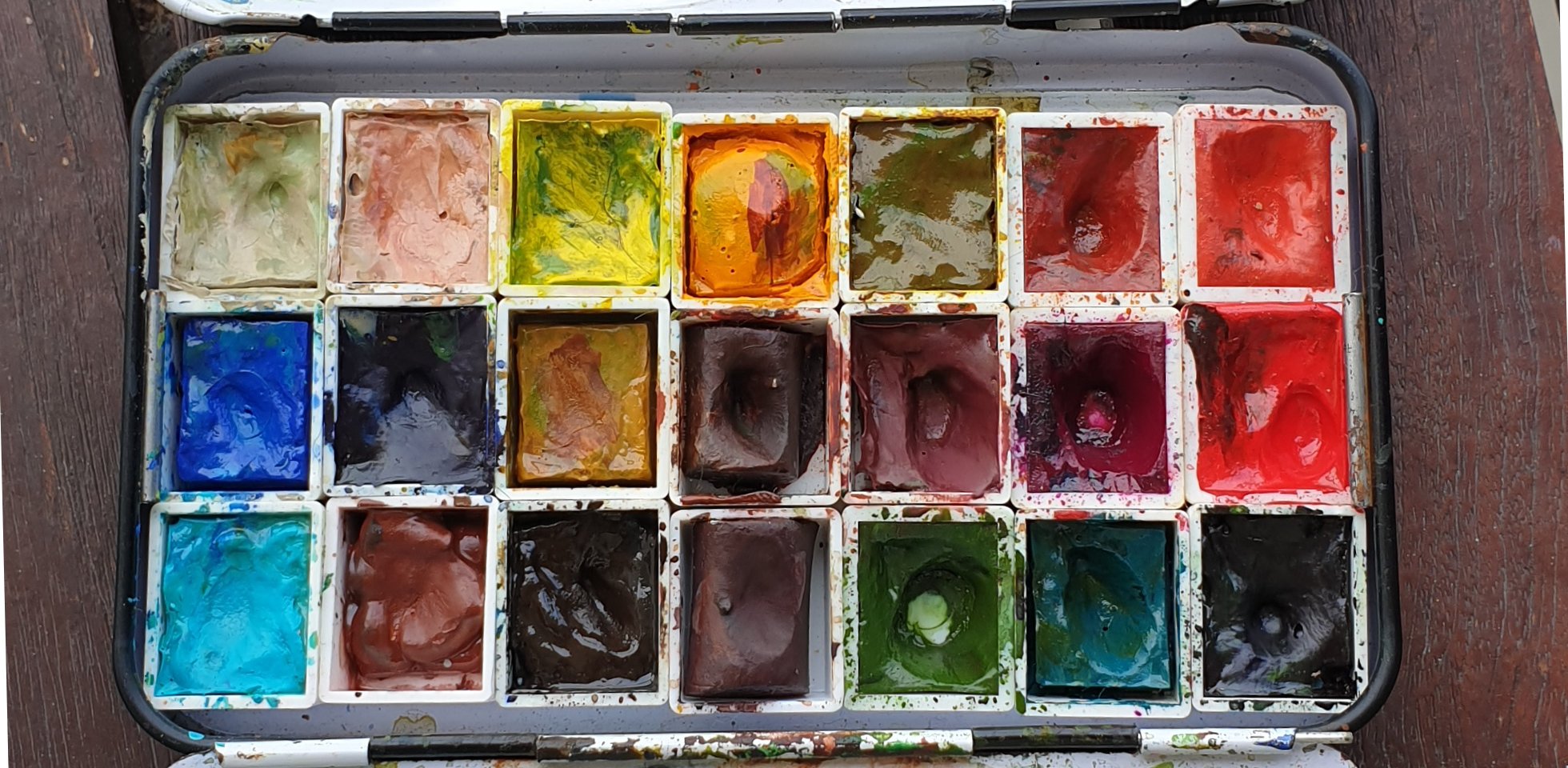
My watercolour travel palette (aka the palette I use 99.9% of the time).
My Colour Loves from this Set
Through this set, I was able to try Van Dyke Brown (Pbr 7), Green Gold (PY 150), Cobalt Green Deep (PB36), and all three have stayed in my palette more or less permanently.
Van Dyke Brown is third from the left in the bottom row, Green Gold is third from the right in the top row and Cobalt Green Deep is second from the right in the bottom row.
They are interesting colours that I really enjoy playing with. Green Gold and Cobalt Green Deep in particular, I would replace with exactly the same pigments or colours in a heartbeat.
I also had what they call Bamboo Green but is more commonly known as Pthalocyanine Green Yellow shade (PG36) for a long time in my palette when I was on Christmas Island, surrounded by lush tropical greens. I would add that back into my palette if I was to travel to a similar region again. Other brands do this colour too of course, but I already have a huge amount of this and it works really well.
In addition to the non-essentials above, two colours in this set have replaced two of my split primary colours: Cobalt Blue No.2 (PB 28), is my current preferred warm blue, and Permanent Yellow Deep (PY 65) is my currently preferred warm yellow.
Cobalt Blue No. 2 is first from the left in the middle row, and Permanent Yellow Deep is the middle colour in the top row.
PBr 25 is a really unique brown that I wish I had space for on my palette too.
The Characteristics of these colours
This is a good quality professional artist brand. The watercolours are pigment based, and mix and generally behave in predictable ways.
These colours are also very bright and vivid. No wishy washy colours and pigments here. If you’re looking for reliably punchy colours, this is a good set. This characteristic is one of the main reasons I was drawn to it. If however you’re hoping these will work like gouache or a halfway hybrid, they don’t, they are definitely watercolours and behave like watercolours. You can of course mix a white gouache in to get gouache-like effects, but they are not gouache.
That said, they do have two characteristics that you’ll either love, or want to consider other paints instead:
They do not ‘move’ as well as some other watercolours, offering more control for newer artists and artists who like or need more control of their colours and placements in their work. If you like your paints to move and come alive in water, these aren't your best bet, but they do move - just not as much as some other brands. I’ve done some fun mixes wet-on-wet below to show how they behave when charged in to one another.
They are slightly more opaque in general than other brands. I actually like this, and often use more opaque colours in my palettes to add ‘heft’ to my colours anyway, but if you are all about transparency, these probably are not your best bet either. Again, these are watercolours and so are transparent, but when using them you will notice a bit more ‘substance’ to them than some other brands.
Some Fun Mixes Wet-on-Wet

Permanent Yellow Light (PY 154), Quinacridone Permanent Magenta (PR 122), Quinacridone Permanent Rose (PV 19), Autumn Orange (PO 36) on Hahnemühle rough watercolour postcard.

Permanent Yellow Light (PY 154), Cobalt Turquoise (PB 28), Cobalt Green Deep (PB 36) on Hahnemühle rough watercolour postcard.

Permanent Yellow Deep (PY 65), Ultramarine Light (PB 29), Pthalocyanine Blue (PB 15:6), Cerulean Blue (PB 15:3) - Pthalocyanine Blue Yellow Shade on Hahnemühle rough watercolour postcard.

Red Brown (PBr 25), Green Gold (PY 150), Bamboo Green (PG 36) - Pthalo Green Yellow Shade , Viridian (PG 7) - Pthalo Green Blue Shade on Hahnemühle rough watercolour postcard.

Yellow Ochre No. 2 (PY 42), Green Gold (PY 150), Red Brown (PBr 25), Van Dyke Brown (PBr7) on Hahnemühle rough watercolour postcard.
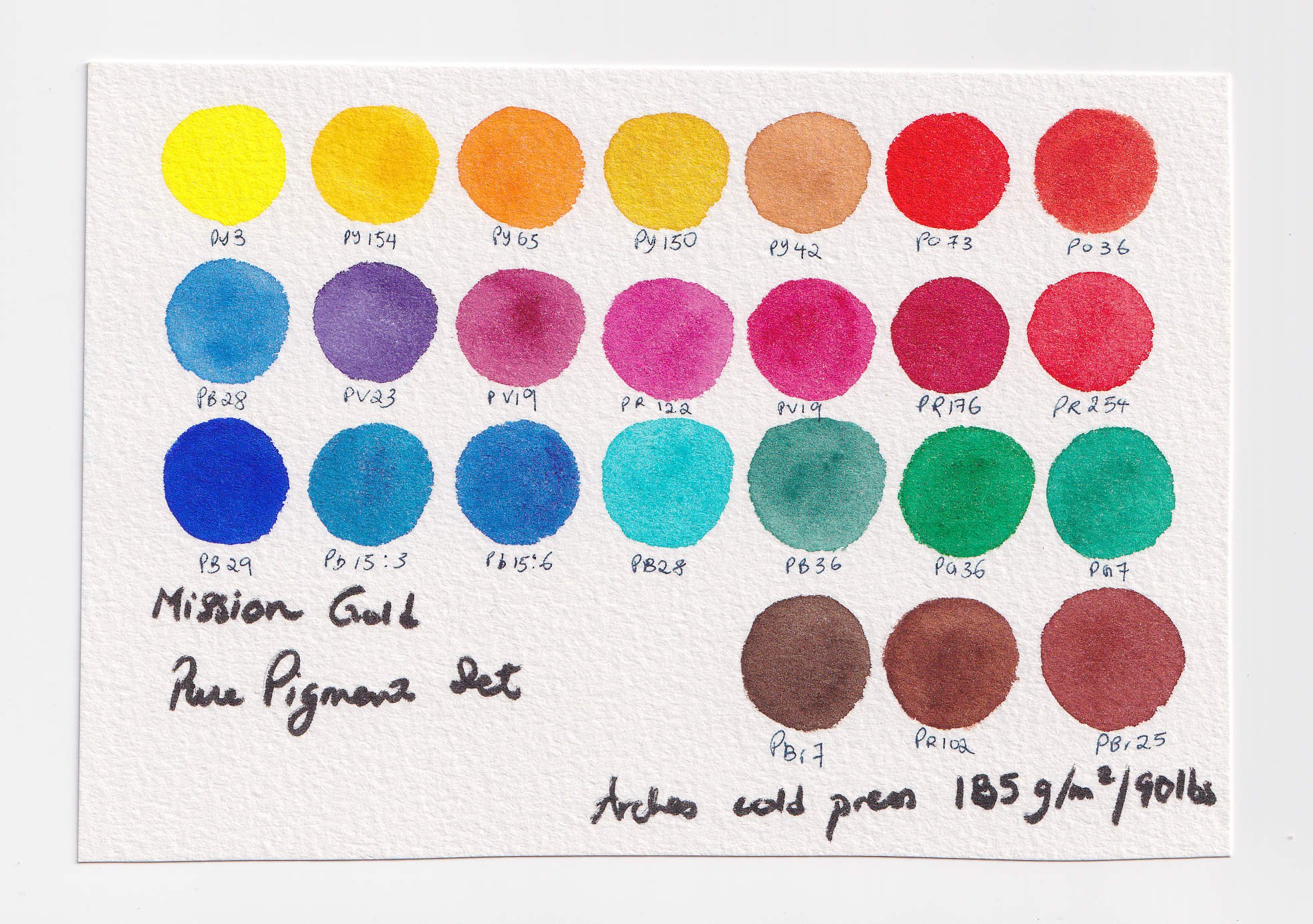
Swatches of Individual Colours


This was swatched on recycled 100% cotton paper, and the swatch cards above were swatched on 100% cotton cold press paper.
Other Really Useful Resources to Help You
Dr Oto Kano has recently created a fabulous database on watercolours by brand and pigment. Here is the link to her Mission Gold page where you’ll be able to find relevant information on all the colours and if she has done a video featuring it, there’ll be a link there too:
http://otokano.com/colors-by-brand/mission-gold/
Sun and Colors is an invaluable resource and database created by Lana where colours are swatched and placed in a sunlit window to test for lightfastness in a home setting. Her database includes tests done on colours in this set, and if you are curious about how they perform in her tests, check out the site: https://sunandcolors.com/
I use Sun and Colors all the time now before I purchase a new colour, and will be checking out Dr Oto Kano’s resources as well before any new purchases.
If you’ve been on the fence about Mission Gold Pure Pigment Set, I hope this post has helped you. Feel free to get in touch if you have any questions.