
Holbein Artists Gouache Primary Set
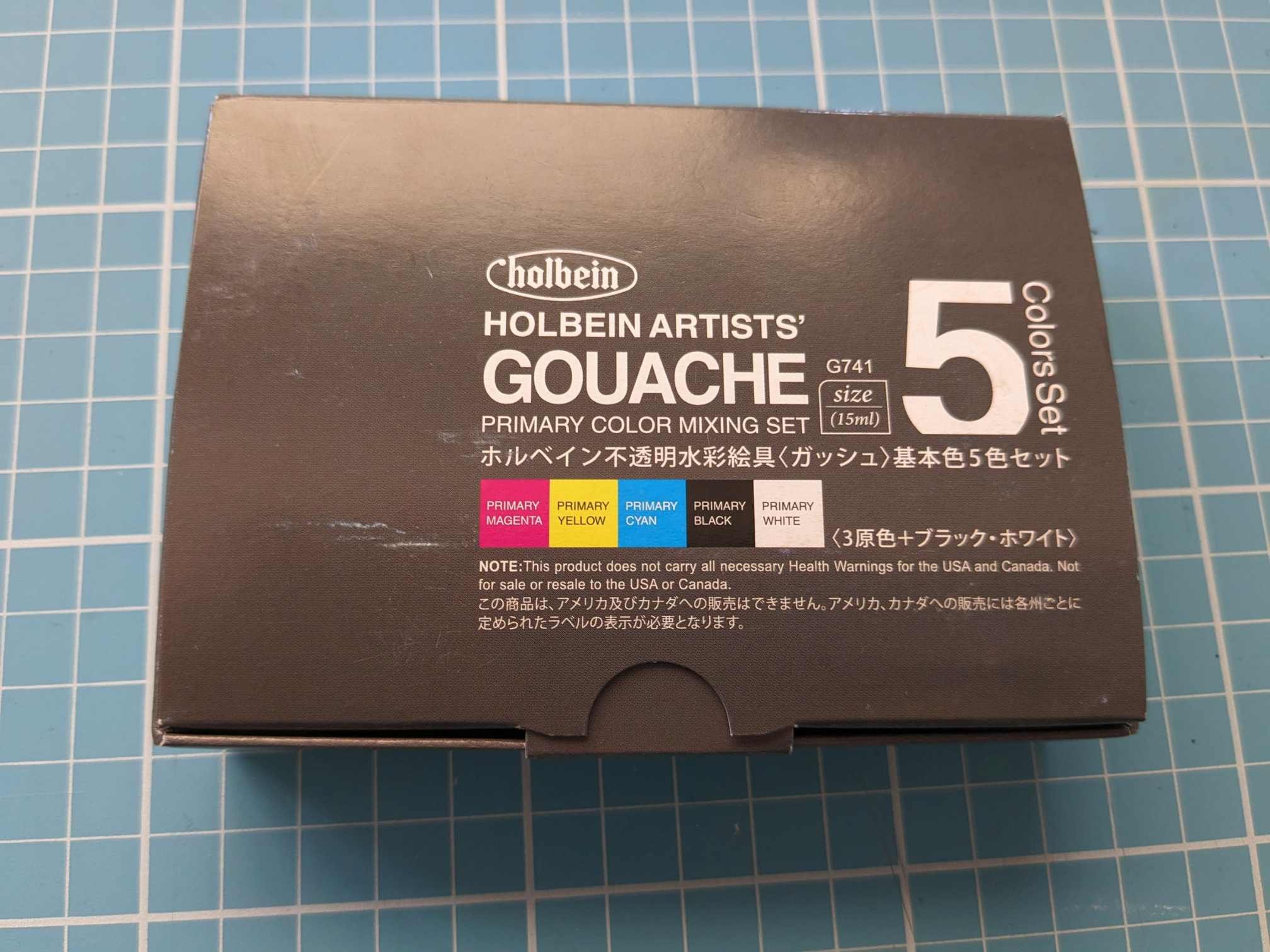
Holbein Artists’ Gouache Primary Color Mixing Set
I’ve been using gouache for about 2 years and 8 months at the time of writing this post. I bought my first tubes of gouache in May 2020 and dabbled in it for a while, however for a lot of the time, my primary medium was watercolour. It wasn’t until 2022 however that I really decided to dedicate a good amount of time to a medium I loved but had put aside in favour of the portability and ease of watercolour pans.
I will write more about my gouache journey in another post, but here, it suffices to say that this was one of the sets I got to start with, along with Holbein’s set of 12 tubes containing 5ml each of gouache and one lone tube of Schmincke Helio Turquoise. This primary set has stayed a core part of my gouache journey since 2020.


The Set
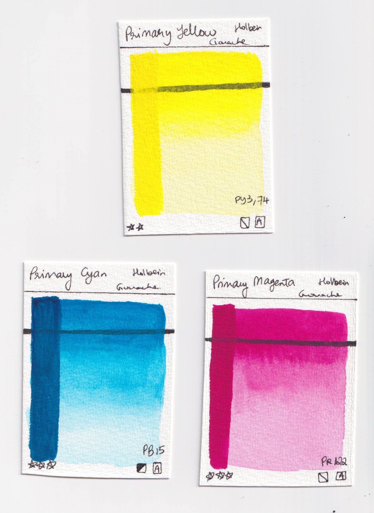
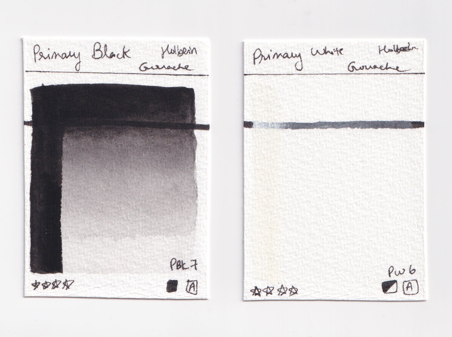
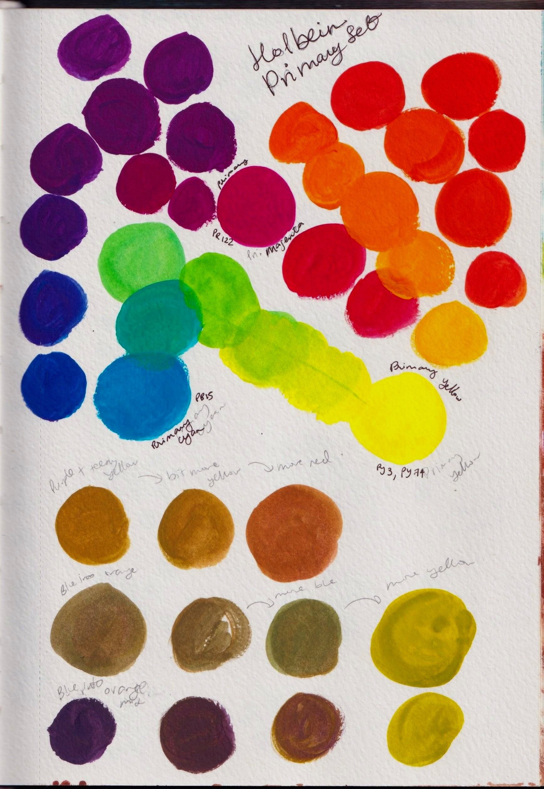
The set comes in this little box measuring roughly 11.5 cm x 8 cm x 2.4 cm. It contains 5 x 15 ml tubes, and the colours included are Primary White (PW 6), Primary Black (Pbk 7), Primary Magenta (PR 122), Primary Yellow (PY 3, PY 74) and Primary Cyan (PB 15).
Opacity
Holbein rates Primary Magenta and Primary Yellow as semi-transparent, Primary Cyan and Primary White as semi-opaque and Primary Black as opaque. Below are my swatches - I would agree with Holbein on the whole, and in my actual work I haven’t found it hard to achieve my desired opacity.
Lightfastness
The lightfastness ratings are generally good and the only one that concerns me is the Primary Yellow, which has a 2-star rating. A good alternative I found is Schmincke’s Cadmium Yellow Hue which uses PY 154, a more lightfast pigment, however here in Australia at least, it is more expensive. Still, if you are going to be selling originals, it would be worth going with a more lightfast yellow to be safe.
The pamphlet that comes with it provides Holbein’s permanency ratings as follows:

The set comes with a useful pamphlet.
4 stars: Absolutely Permanent Colours
3 stars: Permanent Colours
2 stars: Moderately Durable Colours
1 star: Fugitive Colours
no mark shows the colour is not permanent
Four of the five colours in this set have 3 or 4 stars. Primary Magenta and Cyan both have 3-star ratings while Primary White and Black have 4-star ratings. All four of these contain pigments generally considered good for their lightfastness.
If you’re wondering what lightfastness is, it is basically just how long the pigments are expected to last generally in museum conditions without fading or changing their colour dramatically. It is sometimes called permanence, and if you’re looking to display your work, sell or give your work to someone who will be displaying it, it is important to know the lightfastness of your paints so you or your customers don’t face unexpected fading. Note, in direct sunlight, your paintings always will fade faster, so storage and where they’re displayed is important.
Most gouache was traditionally used for design work, so it is often not as lightfast as its watercolour counterpart. That said, it is now a popular medium with artists and many brands have plenty of lightfast colours to choose from if you are going to be selling your paintings. While I don’t often sell my original paintings, I’ve tried to stick to lightfast colours so that if I do choose to sell or give some of my work to family or friends, I know I’ve done what I can to ensure it is lightfast.
Mixing with this set
This set is called the ‘'Primary Color Mixing Set’, but when I first purchased it, I didn’t really explore its full mixing capability because I also had the small set of 12 other colours. In the time since May 2020, I’ve of course used and mixed many of the colours in this set and learnt some of what they’re capable of with my other gouache, but I didn’t really know what it could do on its own.
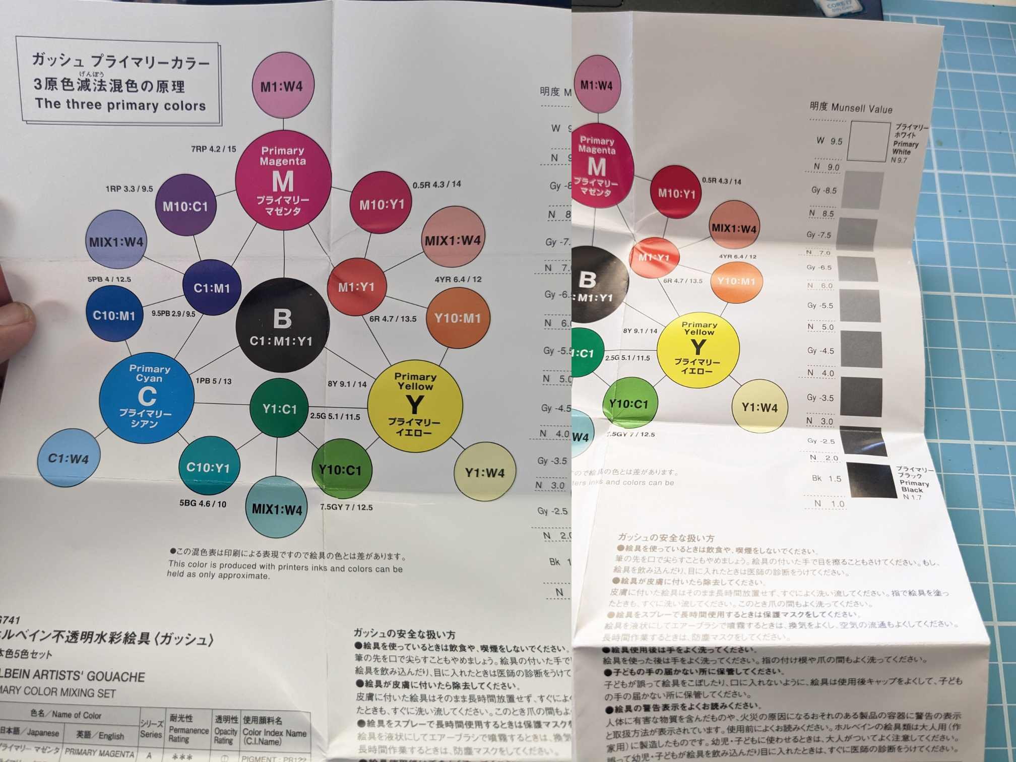
When I purchased a new set of these, I decided I wanted to really test the range of the colours I could get with just this set, so below are some of my own mixing tests. The pamphlet is great and also provides some useful starting points for mixing some useful colours from this set.
Note: when I play with colours, I’m not generally concerned with opacity and am just trying to get a sense of the colours I can mix easily with my supplies.
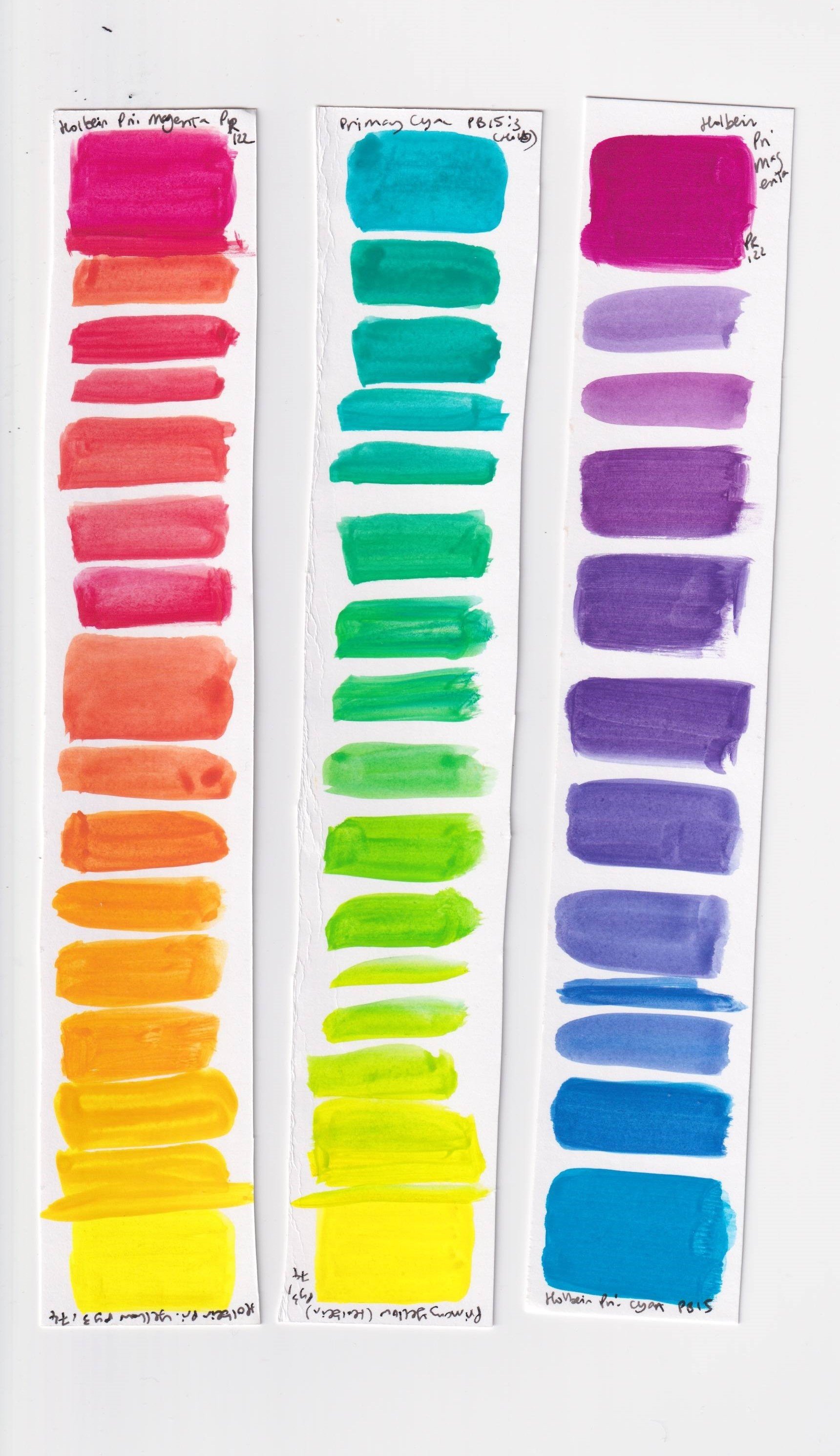
Above is me playing with just cyan, magenta and yellow as well as some transparency and some quick more neutral mixes. Below are the little strips of mixes possible with two colours I did (inspiration for these is from this video on choosing a limited palette by Sarah Burns, a wonderful gouache landscape artist).
Some of the colours above are streaky and transparent - note that while you can get really nice watercolour effects with gouache, the lack of opacity is due to my own swatching as I was more concerned with colour than consistency here. I know how to mix these to the consistency I want so that’s not something I bother with when testing my mixes.

Mixing earthier colours with the Holbein Gouache 5 Primary Color Mixing Set.
One of the things I really wanted to test was the range of neutrals or earthier colours I could get. Above is an entire page of earthy shades I got just by mixing Primary Yellow, Magenta and Cyan.
These can be further adjusted with white and black to of course get slightly different colours with darker and lighter values. The set allows for some versatile olive greens, reddish browns, ochres, blue-grays and some darker browns even without mixing in any black.
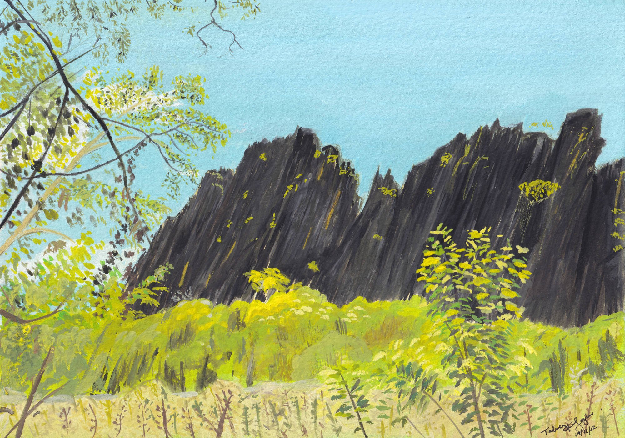
Below are three recent illustrations I’ve done with just this set.
Bandilngan (Windjana Gorge) Illustration.

Illustration of a section of the view at our site in the Dales campground, Karijini National Park.

Stylised illustration of some lotuses - not my usual style, but I did the background as part of a course I’m taking online, and added the lotuses on top because it looked like they needed to be there.
It is a really versatile set, and I see it staying as a core part of my gouache practice for a long time. That said, I personally do like using some convenience mixes with my gouache namely a yellow ochre, a reddish brown and a dark brown. I also like having ultramarine blue and a bright, warm red.