
Qor Earth and High Chroma Sets
I’ve had the High Chroma and Earth sets by Qor watercolors for over a year now. They weren’t really a brand on my list of brands to try. More specifically, I was pretty happy with the watercolours I had, but before we started on our road trip, I was feeling very much like I wanted some more granulating colours, and some colours that moved more, for more dynamic sketches. In that process, I thought to try these two specific sets because the colours really appealed to me, and they were colours I would definitely get use out of.
In Australia, I bought these sets from Adamstown Art - a shop I have bought from a few times and one I love for their great range of watercolour brands. If you’re in Australia, they’re worth checking out - I find I usually have to shop around for different supplies, but for watercolours specifically, if I’m buying online, I will look at them first.
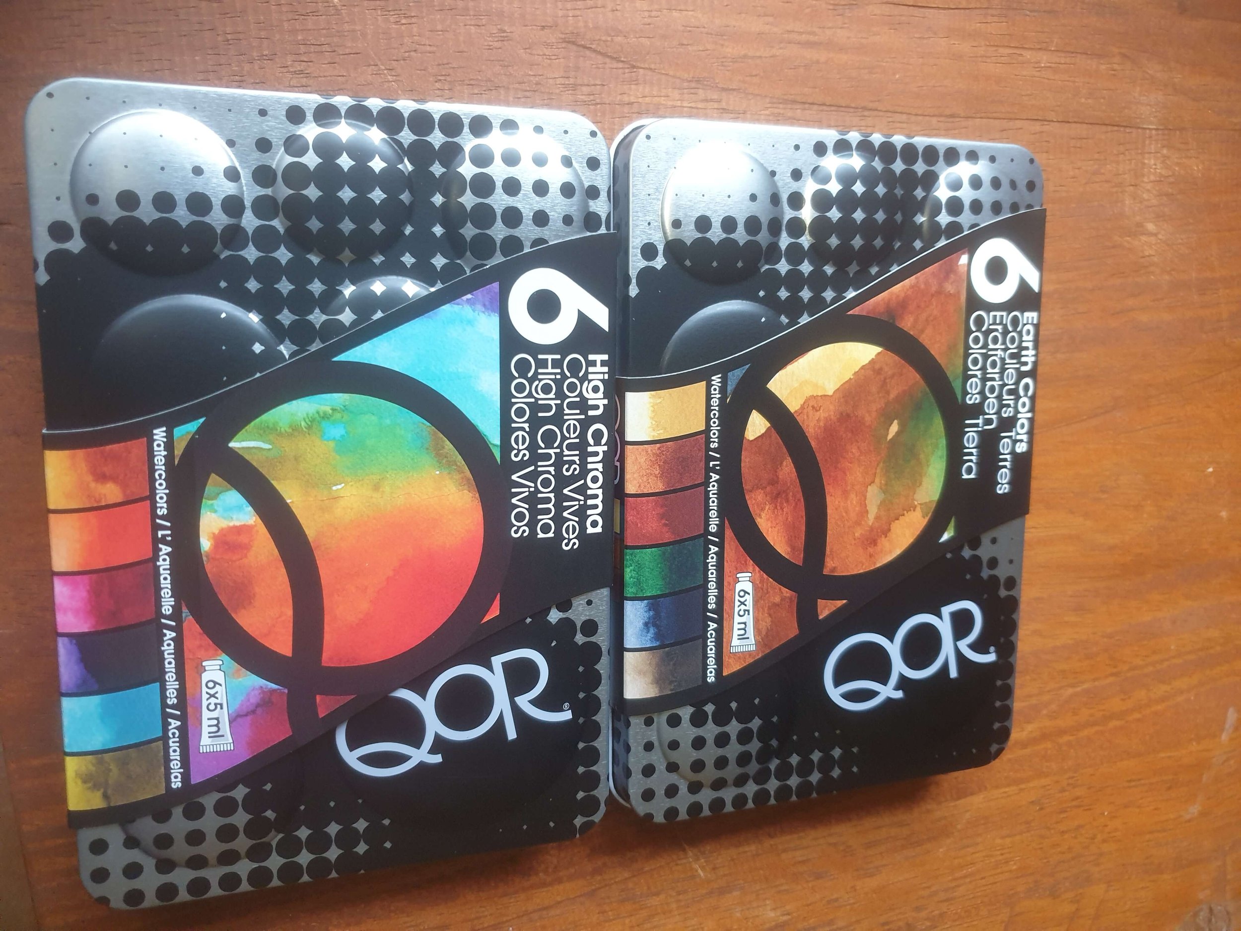
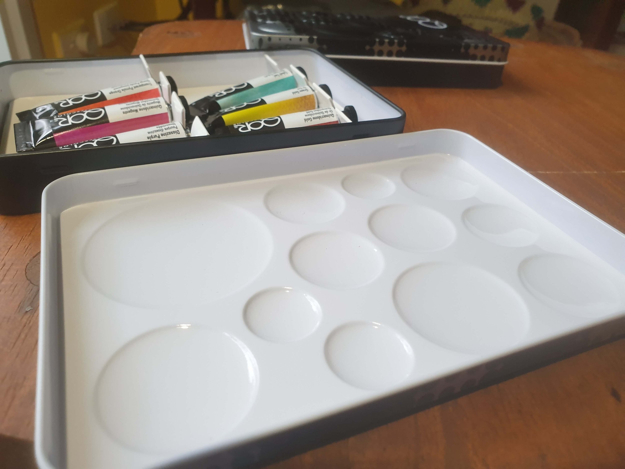
In terms of packaging, they come in metal tins that open fully as you can see above. The lid is a really functional palette, and I really do like the tins, but I do find these tins harder to sketch with on the go or when hiking. I use these one of tins as my main ‘studio’ watercolour palette. It houses colours I’m looking to learn more about as well as some tried and true favourites. The other tin, I mainly use to store tubes of paint and sometimes use the lid as an extra palette.
The Colours
High Chroma Set

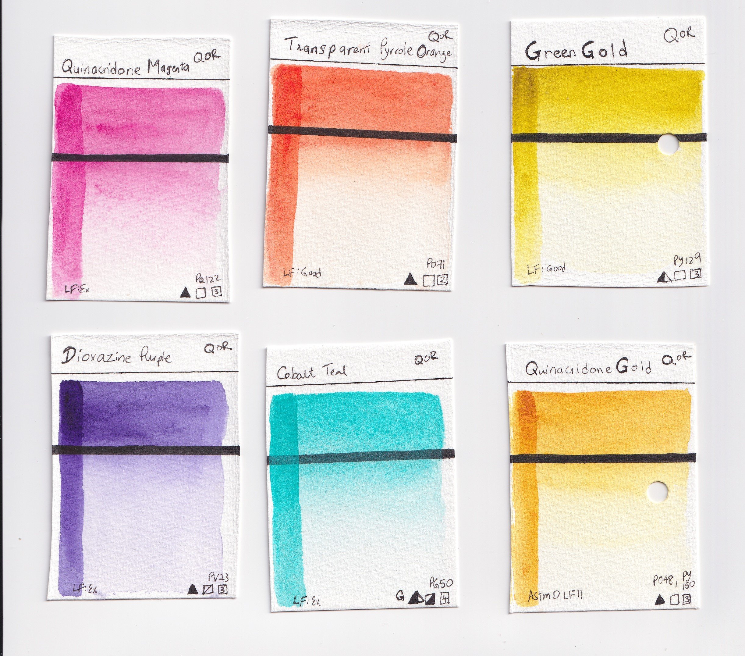
The colours in the High Chroma set are: Cobalt Teal (PG 50), Green Gold (PY 129), Quinacridone Gold (PO 48 and PY 150), Transparent Pyrole Orange (PO 71), Dioxazine Purple (PV 23) and Quinacridone Magenta (PR 122).
Quinacridone Gold and Green Gold were the only two pigments/pigment combinations in this set that I had not previously tried. This set contains some of my all time favourite pigments including PG 50, PR 122 and PO 71. Cobalt Teal (PG 50 or 28) is my usual preferred teal/cyan colour in a primary triad and a PR 122 is usually my preferred Magenta. The only thing this set is missing to make a really great range of colours is a more neutral yellow.

Qor High Chroma Set: Green Gold, Quinacridone Gold, Transparent Pyrole Orange, Cobalt Teal, Dioxazine Purple and Quinacridone Magenta
These colours are just stunningly vibrant.
Earth Set

In terms of the Earth set, the colours are a whole different range of pretty. The colours in the Qor Earth Colours set are: Naples Yellow (PBr 24, PBk 7 and PW 4), Transparent Brown Oxide (PR 101), Venetian Red (PR 101), Sap Green (PG 26, PR 101 and PY 150), Indigo (PB 15:3, PBk 7 and PV 19) and Raw Umber (PBr 7).
This set appealed to me because I felt my palette was lacking a granulating deep brown. Apart from that, the Indigo, Sap Green and Venetian Red just look gorgeous. In terms of pigments, while I have tried PBr 7 and PR 101 browns before, both of these pigments make a range of hues so I was still excited about these. The other three colours are each a mix of three separate pigments, which I don’t usually go for in watercolours, but here, I was very intrigued.

Qor Earth Colours Set: Naples Yellow, Transparent Brown Oxide, Venetian Red, Sap Green, Indigo and Raw Umber

Flow and Dispersion
Qor watercolours’ point of difference in the market is their aquasol binder for their pigments which also in theory allows for greater dispersion when used wet-in-wet. Wet-in-wet is not how I usually use my watercolours, but I was still keen to have this option as an added bonus when I do want to experiment with watercolour.
Below, I have shown some wet-in-wet results when I wet a Hahnemuhle rough pressed watercolour postcard, and charged in a line of paint from each colour. You can see the movement of each colour into the next

Qor High Chroma set - charging a line of each colour wet on wet.

Qor Earth Colours set - charging a line of each colour wet on wet
Then I did the same, but instead of charging in the colours a line at a time, I just randomly dotted the colours to see what sorts of effects it would create. Below are the results.
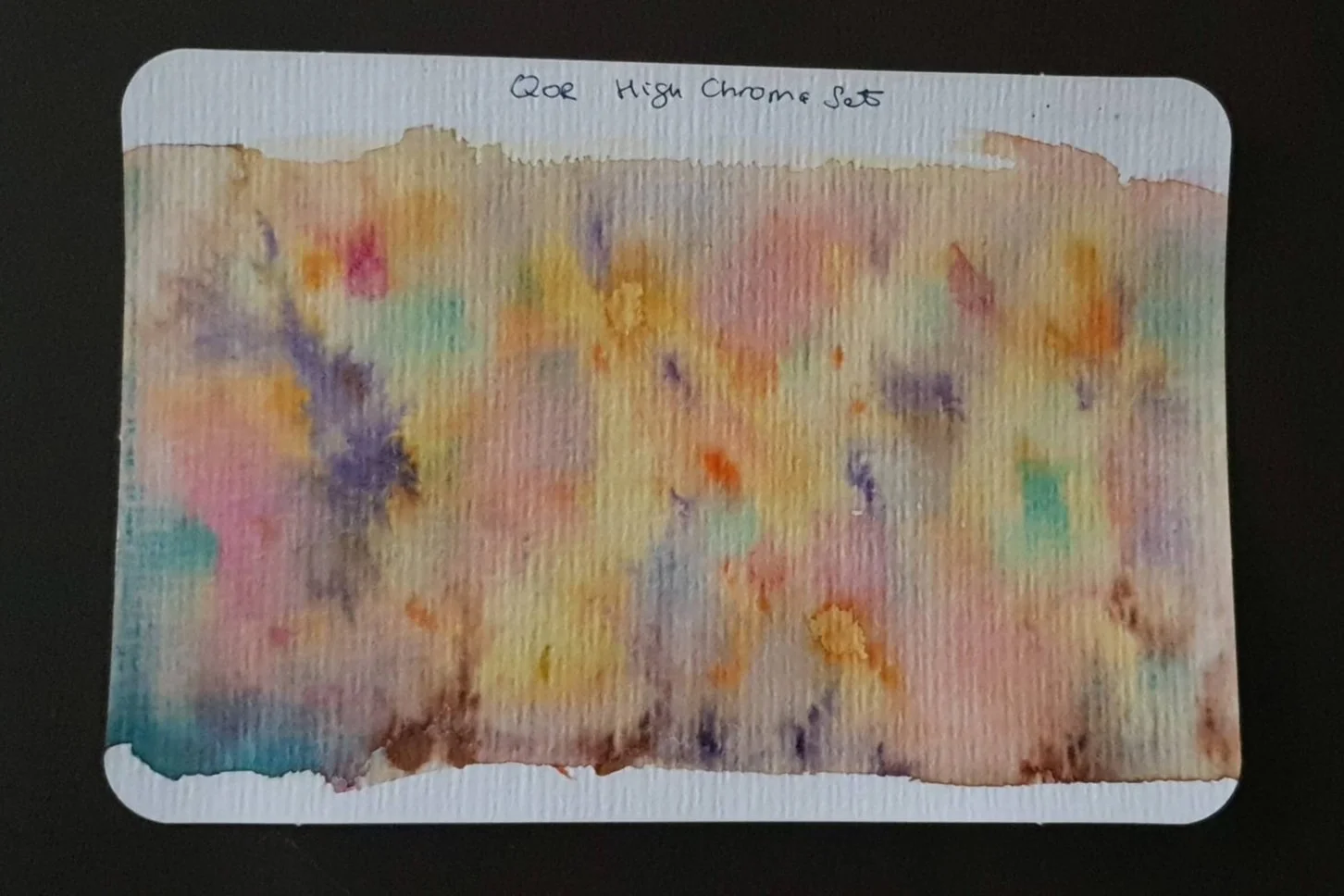
Qor High Chroma Set: wet on wet, charging in a dot of each colour in random spots
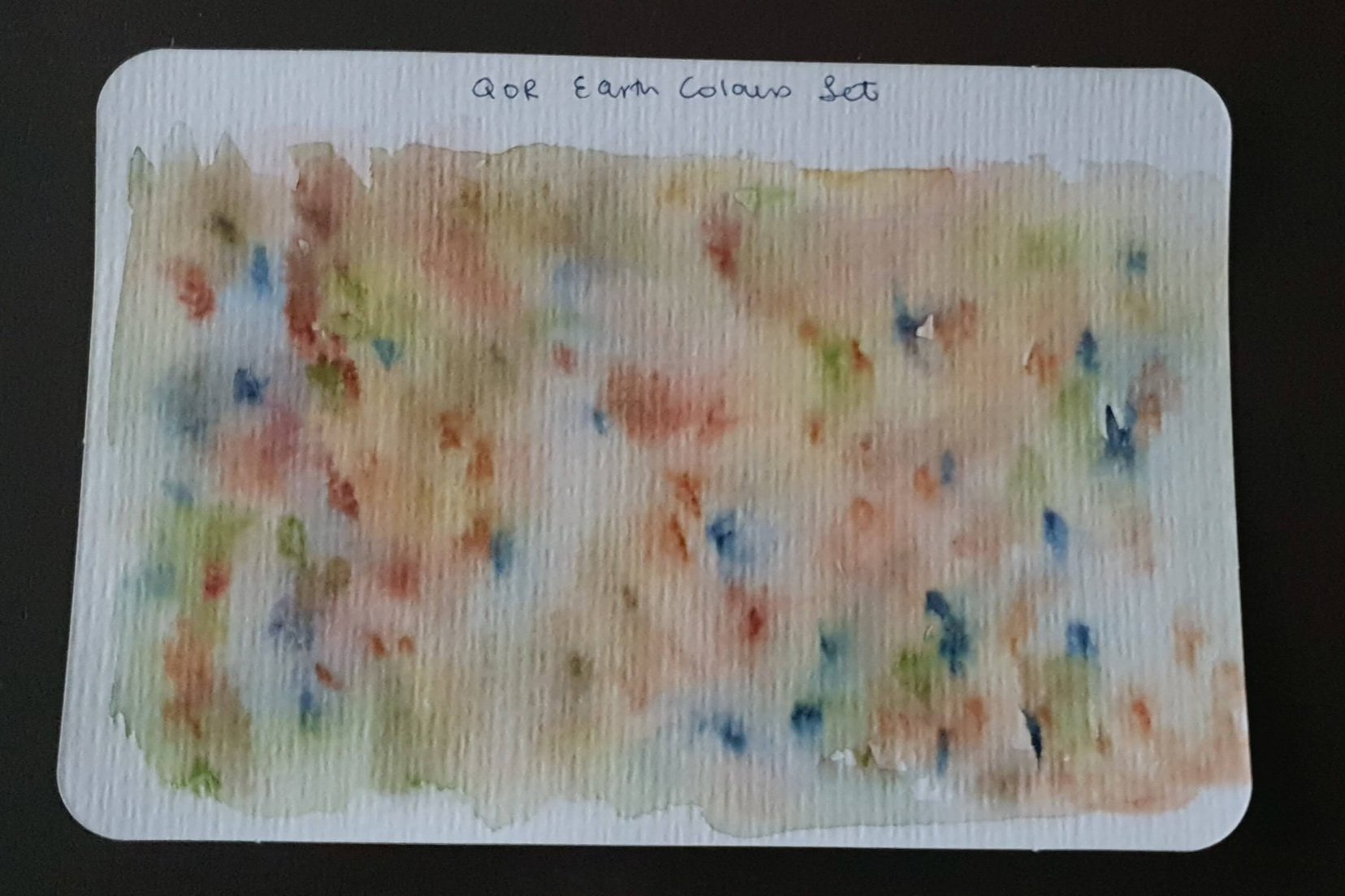
Qor Earth Colours Set: wet on wet, charging in a dot of each colour in random spots
Mixing
Below are some mixing charts I did on recycled 100% cotton paper. This paper is off-white, textured and while watercolour works on it, it is not specifically made for watercolour. That said, for swatches, it did the job.
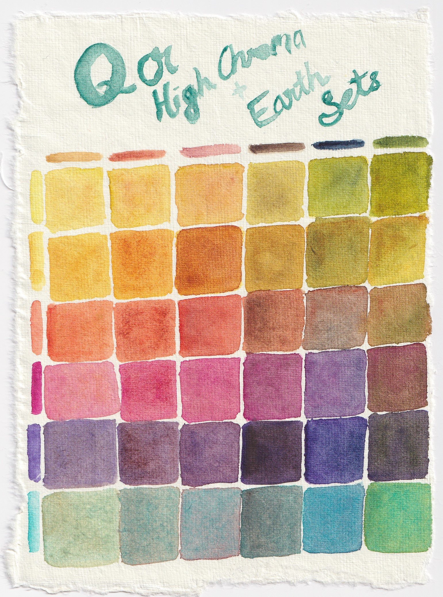
I wanted to see the range of colours I could get by mixing these two sets together. Here is a scan of a colour chart mixing Qor’s Earth Colours set with its High Chroma set.
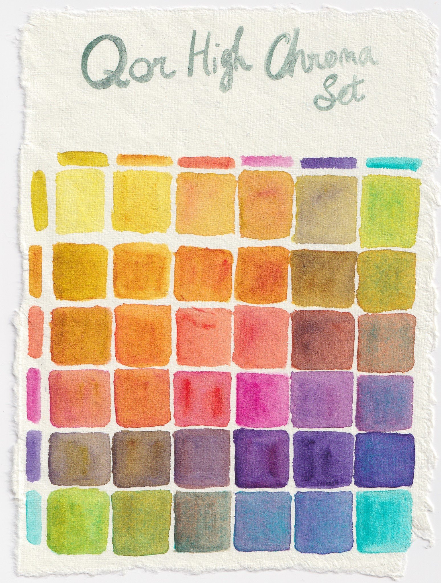
This is a mixing chart of the High Chroma set.
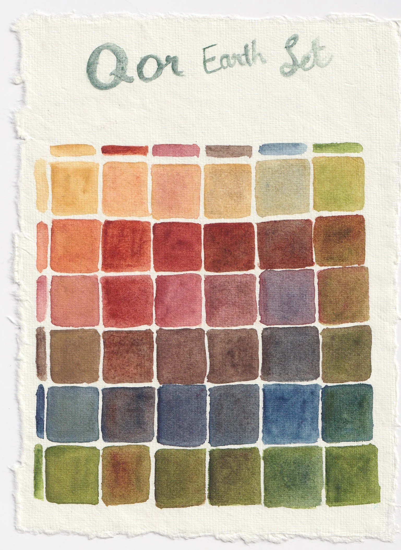
Above is a mixing chart of the Earth Colours set.
The scans below are a couple of extra mixing postcards I created for myself to see the sorts of greens I can make with Cobalt Teal mixed with Green Gold, Quinacridone Gold and Transparent Orange respectively.
Greens by mixing Cobalt Teal, Green Gold and Quinacridone Gold. These make some lovely bright greens.
Earthy Greens and browns by mixing Cobalt Teal and Transparent Pyrole Orange. I absolutely love this range. These two colours together are so useful.

This painting of Palm Valley was mostly painted with these sets - Venetian Red features heavily as well as Sap Green, but I also used Indigo, Green Gold, Napples Yellow, Quinacridone gold, Raw Umber and Cobalt Teal.
Overall Thoughts
While I haven’t used these as much as I would have liked, I do really love using them when I do. They have been particularly fun for experimenting with a looser style of painting, and I have a separate palette for loose, landscape paintings that features all 12 of these colours.
Some downsides are:
They are definitely on the pricier side
Venetian red in my set took a while to dry in its well, and in the meanwhile it had spread into the mixing areas/other half pans in my palettes. It hasn’t happened with any of the other colours in this set, but this spilling was very noticeable.
Upsides:
Noticeably vibrant colours
Super easy to use and rewet
Dispersion is fun to play with
The tin is nice
Going forward I definitely want to play with these a lot more, but after a year of owning these, I do really like them.